Neesa’s Kitchen Case Study

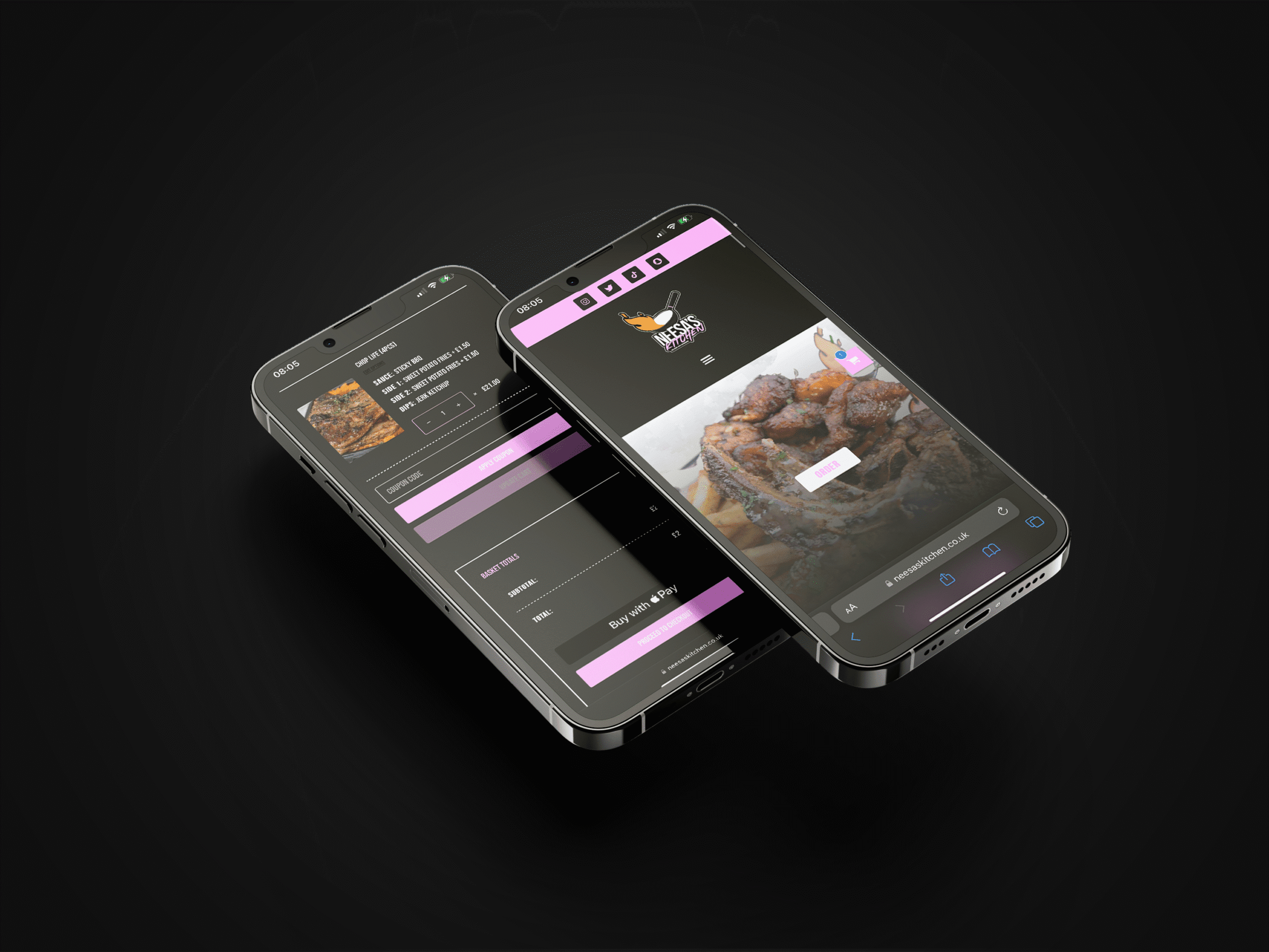
Neesa’s Kitchen is an American soul-food restaurant beloved for its homey flavors and warm hospitality. Despite its delicious offerings and strong local following, its online presence lagged behind, making it difficult to capture orders directly and enhance customer experience digitally. Our team partnered with them to design and launch a fresh, conversion-focused landing page that not only showcased their culinary charm but also integrated a seamless food-ordering system—bringing their soulful food directly to patrons with ease.

From Soul Food to Seamless Orders: Neesa’s Kitchen’s Digital Upgrade

Client Name: Aneesa
Industry: American-Soul Food Resturant 
Project Duration: 2 Weeks

The primary challenge for Neesa’s Kitchen centered on modernising their online presence while preserving the authentic, home-cooked feel they were known for. The existing web setup lacked functionality—customers couldn’t place orders online, and the page didn’t effectively communicate key details like menus, specials, or the story behind the brand. Additionally, poor mobile experience and inconsistent branding diluted their digital impact, resulting in missed orders, customer confusion, and limited reach beyond walk-ins and word of mouth.

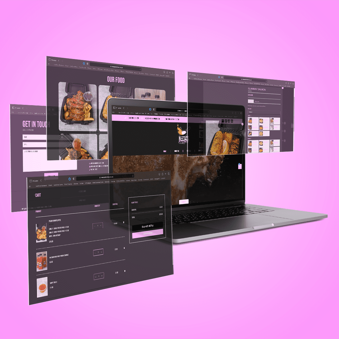
To address these gaps, 36 Visuals delivered a brand-aligned landing page that featured:

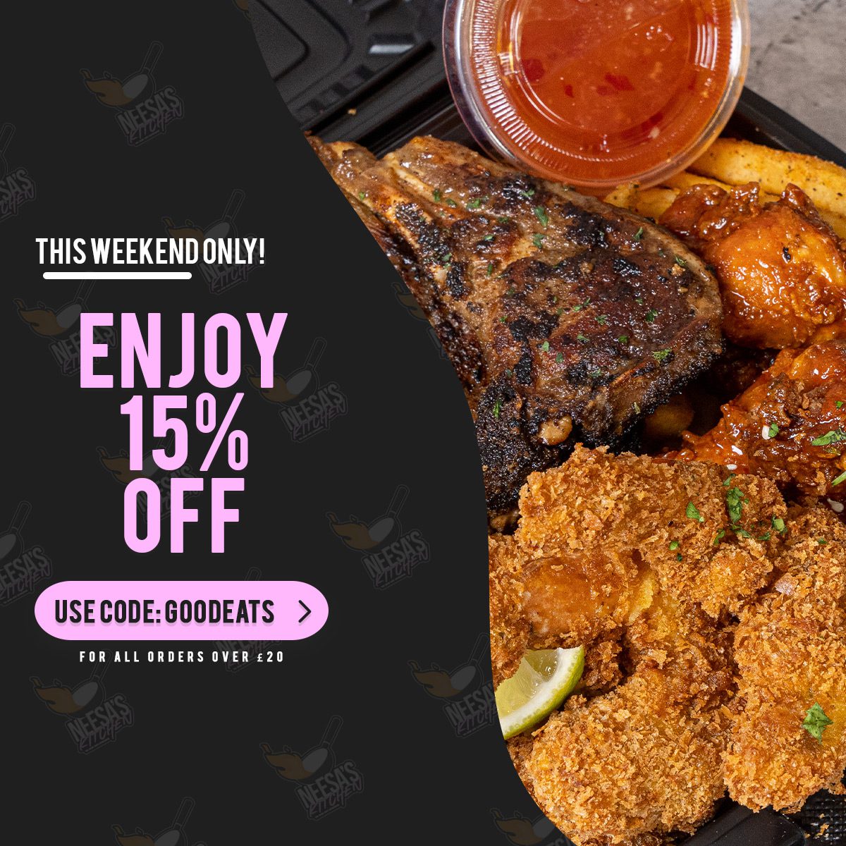
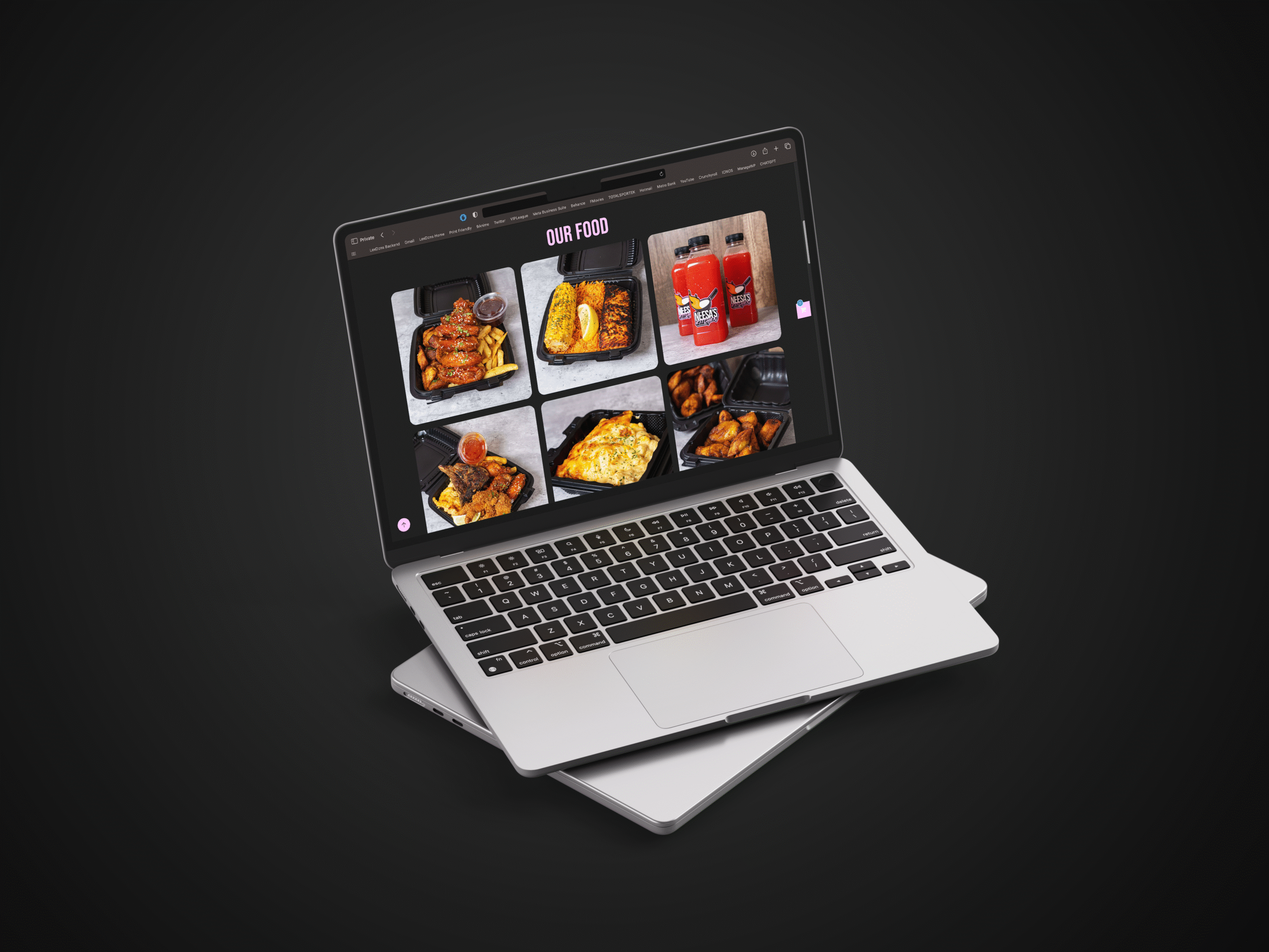
  • A clean, appetising visual layout showcasing hero imagery of signature dishes and the warmth of Neesa’s Kitchen.

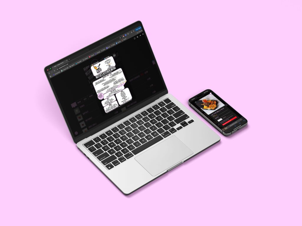
  • An integrated food-ordering system that enabled mobile or desktop visitors to browse, add to cart, and order with just a few taps.

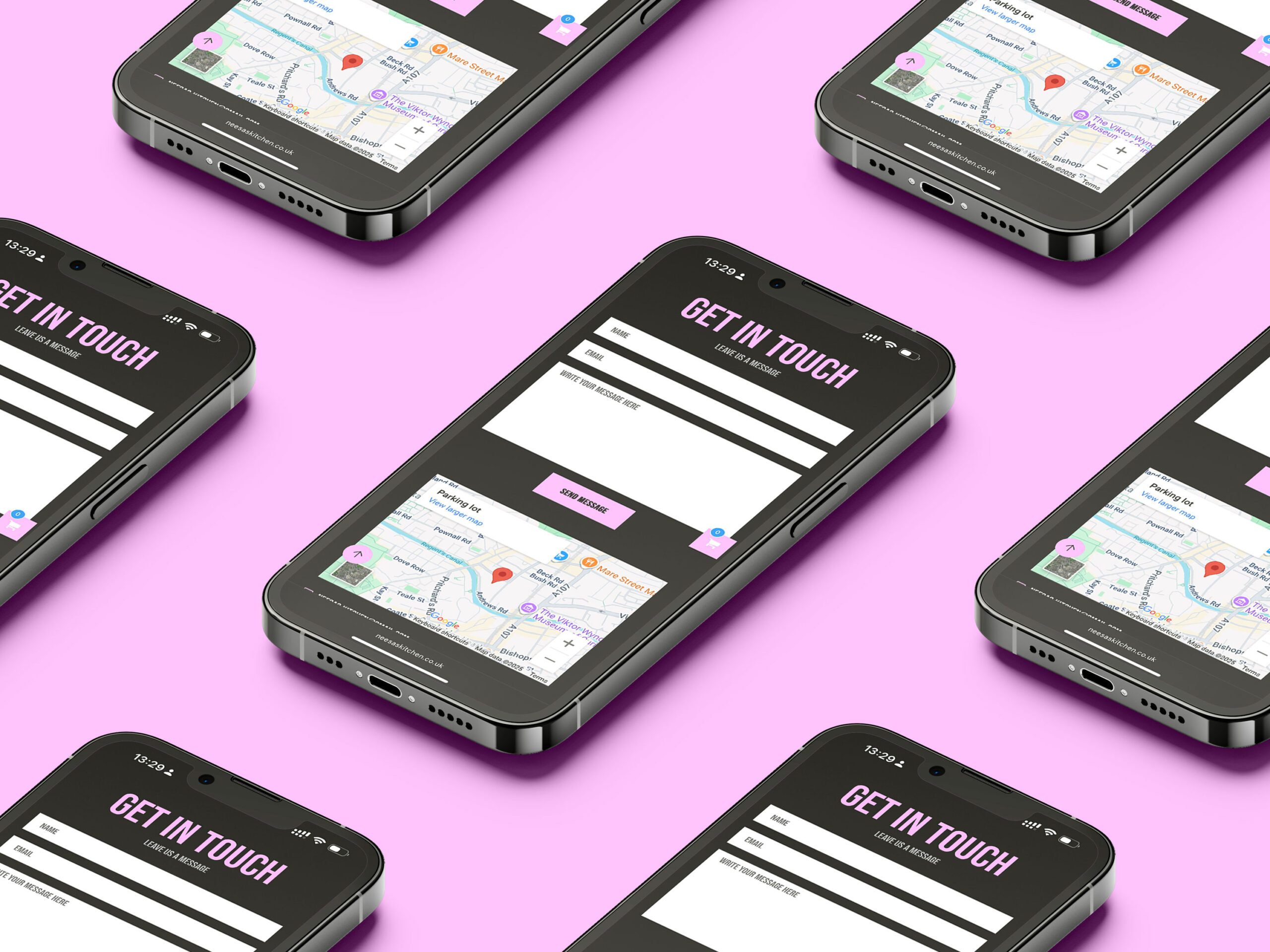
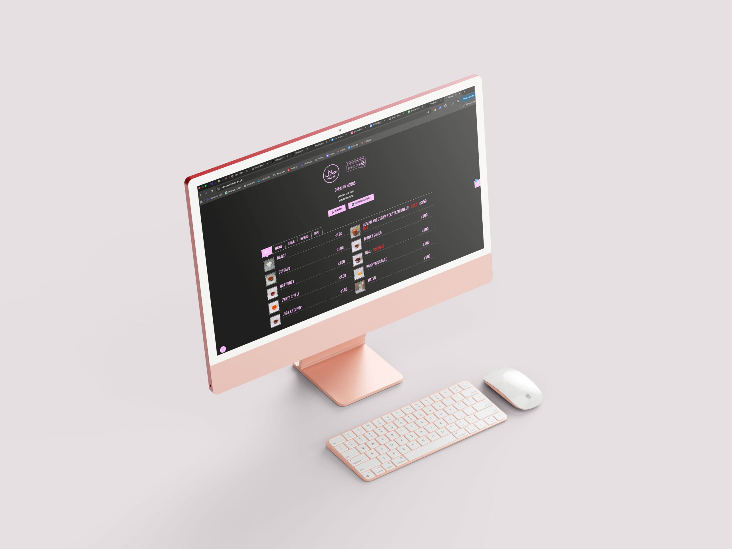
  • Clear, well-structured information blocks for menus, contact details, and a brief brand story to build connection.

  • Optimised mobile experience with fast load times, easy navigation, and finger-friendly ordering buttons.

  • Cohesive branding elements—colour palette, fonts, and voice—that conveyed soulful warmth and homely authenticity across the page.

By blending mouth-watering visuals with user-centric functionality, we created a landing page that felt like walking into Neesa’s cozy kitchen, even through a screen.

The new landing page drove tangible impact:

  • Online orders surged by 60% within the first month, as patrons could now order seamlessly.

  • Mobile conversion rates doubled, thanks to the user-friendly interface and speedy checkout flow.

  • Dwell time increased by over 35%, with visitors engaging longer thanks to the compelling visuals and clear menu presentation.

  • Feedback from Neesa’s team highlighted the site’s “homey feel that still looks professional,” helping them attract new customers while deepening loyalty among existing ones.

This transformation allowed Neesa’s Kitchen not only to modernise its digital storefront but also to scale with confidence—bringing its soulful food to more satisfied customers, online and beyond.

Cheers mate

Amani Matunda CEO