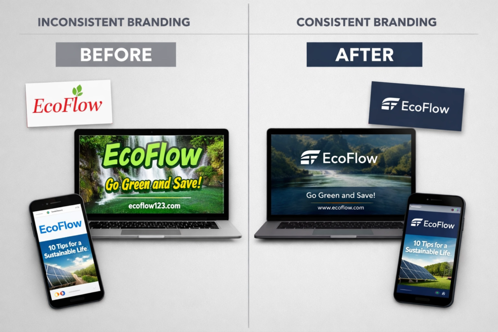
Picture this. Someone finds your business on Instagram, loves what they see, and then Googles you. But your website looks completely different. The colours are off, the logo looks stretched, and the whole vibe feels like a different company. That first spark of trust? Gone. This is exactly why a consistent brand identity matters so much — and it’s one of the most common problems we fix for small businesses every day at 36 Visuals.
The good news? You don’t need a huge budget or a team of designers to get this right. You just need a solid brand identity system — and this guide will walk you through exactly what that looks like.
Quick Summary:
What Is a Consistent Brand Identity? (And Why It’s More Than a Logo)
A lot of people think their brand is their logo. But your brand identity is actually the whole package — every visual and verbal element that represents your business.
A full brand identity includes:
- Your logo — in multiple versions (more on that below)
- Your colour palette — the exact shades used across everything
- Your typography — the fonts you use and how you use them
- Your imagery style — the look and feel of your photos and graphics
- Your brand voice — how you sound in writing
When all of these elements work together consistently, people start to recognise you instantly — whether they spot you on TikTok, pick up your leaflet, or land on your website. That recognition builds trust, and trust leads to sales. In fact, research by Lucidpress found that consistent brand presentation across all platforms can increase revenue by up to 23% — which is a pretty big deal for a small business. Not sure if yours is doing that right now? Our quick Brand Quiz will tell you in under two minutes.
Why a Consistent Brand Identity Across All Platforms Matters
These days, your customers see your brand everywhere. Think about all the places your business shows up:
- Instagram, Facebook, TikTok, LinkedIn
- Your website
- Google Business Profile
- Printed flyers, business cards, and banners
- Email newsletters
- Packaging and stickers
If your brand looks slightly different in each of these places, it creates confusion. And confused customers don’t buy.
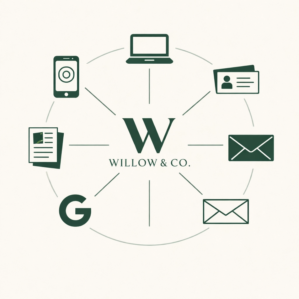
The goal of a consistent brand identity is simple: no matter where someone finds you, it should feel like you. Same energy. Same colours. Same fonts.
The 5 Core Elements of a Consistent Brand Identity
Here’s what you actually need to get your brand consistent everywhere.
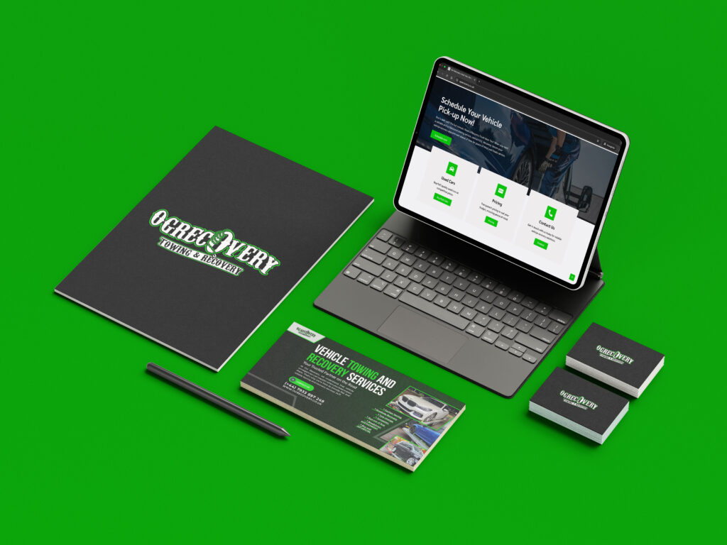
1. A Versatile Logo System
A single logo file won’t cut it. You need a proper logo system with multiple versions:
- Primary logo — the full version with your name and icon
- Secondary logo — a stacked or simplified version
- Icon-only mark — for profile pictures, favicons, and app icons
- One-colour version — for printing on pens, bags, or embroidery
- Reversed version — white logo for dark backgrounds
Your logo needs to look great at every size — from a tiny favicon in a browser tab to a giant banner at an event. If you only have one logo file and it was built in Canva, a professional logo system will make an immediate difference to how your business is perceived.
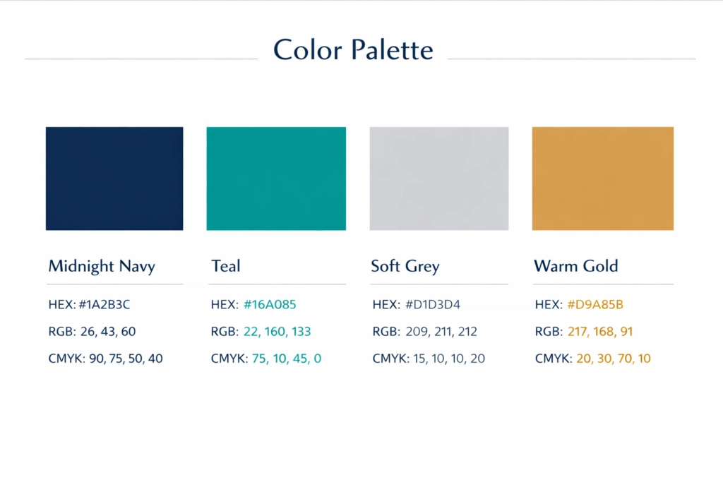
2. A Defined Colour Palette
Your colours need to be exact — not just “kind of blue.” Each colour should have a defined:
- HEX code — for screens and digital use (e.g., #1A2B3C)
- RGB values — for digital design software
- CMYK values — for print (this is different to digital!)
- Pantone reference — for professional print work
A good palette usually has 1–2 primary colours, 1–2 secondary colours, and a set of neutral shades. Stick to these religiously and your brand will look polished everywhere.
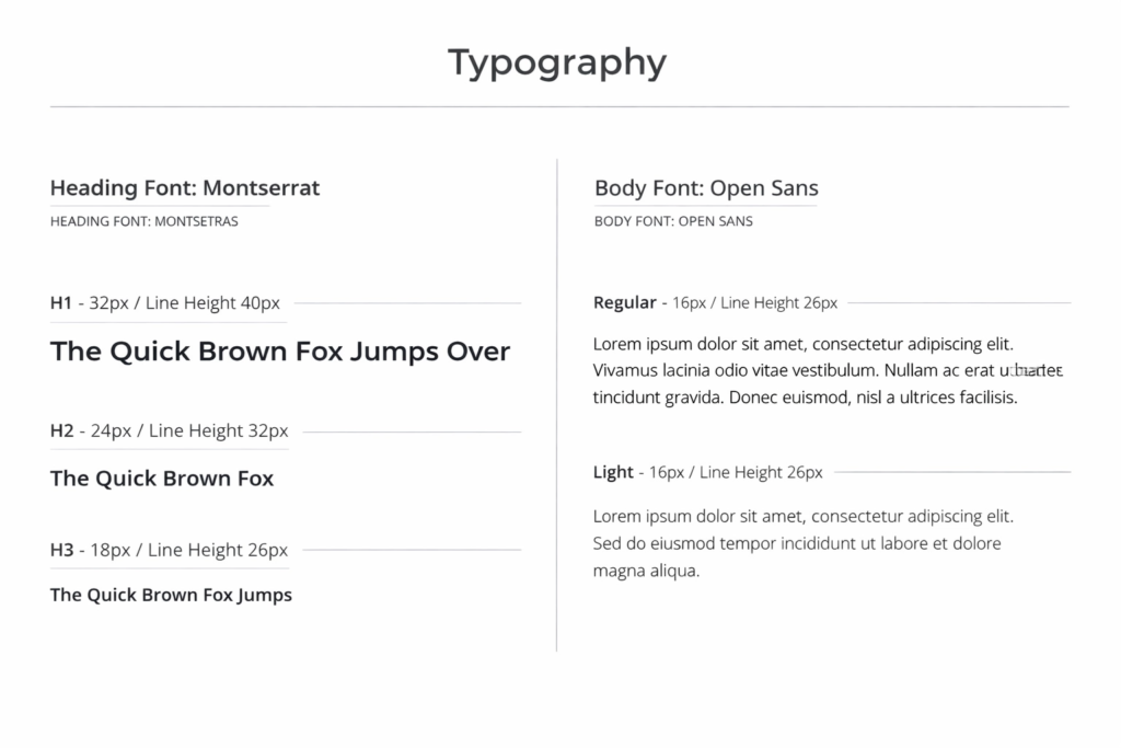
3. Typography Rules
Your fonts say a lot about your brand. A modern sans-serif feels very different to a classic serif or a handwritten script. Whatever you choose, document it clearly:
- Heading font — for titles and big statements
- Body font — for longer text and descriptions
- A web-safe fallback — in case your custom font doesn’t load
And use them consistently! If your Instagram posts use one font and your website uses three others, it creates a messy, unprofessional look.
4. A Consistent Brand Imagery Style
This one gets overlooked a lot. Your photos and graphics should all feel like they belong to the same brand. That means deciding on:
- Photography style — bright and airy? Dark and moody? Candid or polished?
- Illustration or graphic style — flat icons? Bold shapes? Subtle textures?
- Filters or colour grading — a consistent edit style for all images
Stick to one style and your feed, website, and print materials will all feel cohesive. This is something we build into every brand identity design project we take on — so nothing is left to chance.
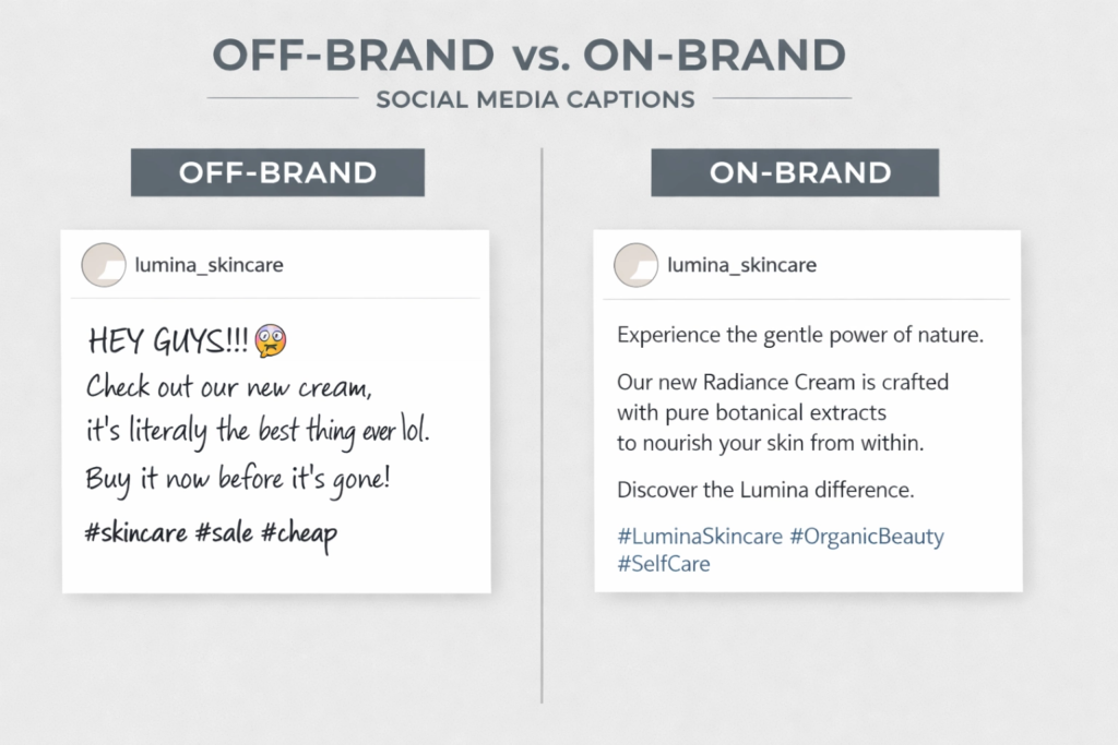
5. A Clear Brand Voice
Your brand identity isn’t just visual — it’s verbal too. How you write your Instagram captions, your website copy, and your flyer text all contribute to how people experience your brand.
Are you friendly and casual? Professional and authoritative? Playful and fun? Define your tone and stick to it everywhere. Consistency in voice builds just as much trust as consistency in visuals.
How to Keep a Consistent Brand Identity Across Every Platform
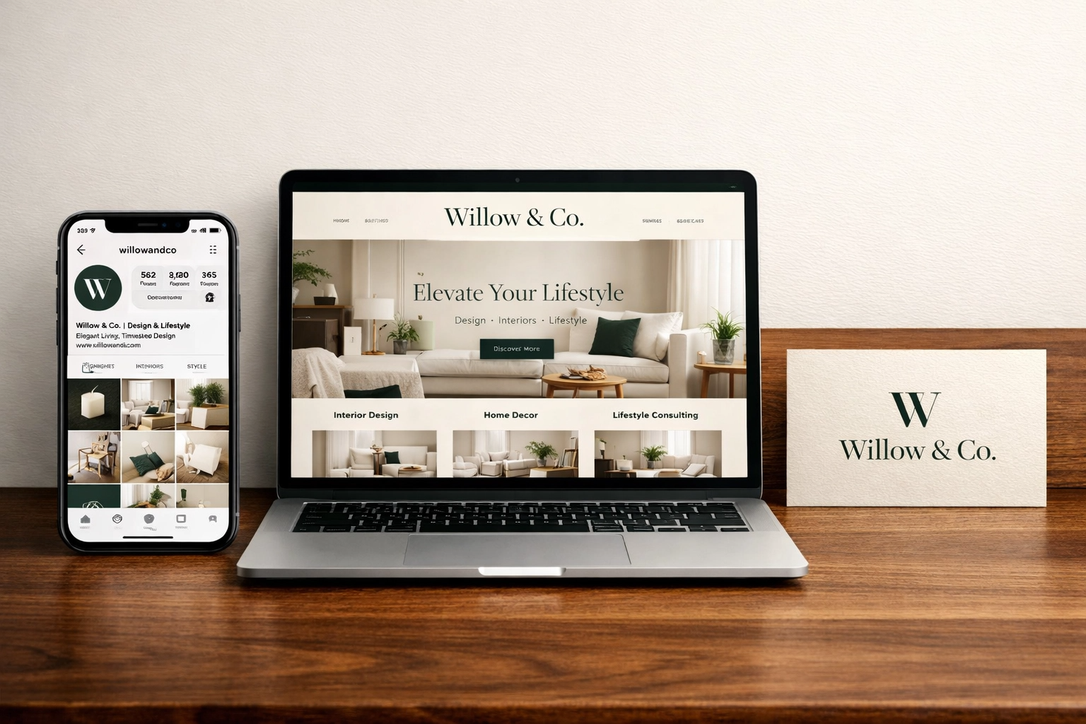
Here’s the big secret: adapting your brand to different platforms is fine — as long as the core identity stays the same.
This is called an adaptive brand system, and it’s what separates hobbyist design from a truly consistent brand identity built to last.
Think of it like a wardrobe. Your personality doesn’t change when you dress up for a business meeting versus a casual weekend. But your outfit adapts to the context. Your brand should do the same.
Here’s how to adapt without losing yourself:
Social Media:
- Use your icon-only logo for profile pictures (it reads clearly at small sizes)
- Create post templates in your brand colours and fonts
- Keep the same tone of voice across every platform
- Use Canva or Adobe Express — but customise the templates to your brand, not theirs
Your Website:
- Make sure your logo is exported in the right format (SVG or PNG with transparent background)
- Check your HEX colours are applied correctly — screens can shift colours slightly
- Use your brand fonts via Google Fonts or a font licence
- Make sure your website is built to be mobile-friendly — over 60% of UK web traffic comes from mobile (Statista, 2025), and a smart website makes this effortless from day one
Print:
- Always use CMYK colour values for printing (not RGB or HEX)
- Use high-resolution files (300dpi minimum) for anything that will be printed
- Add bleed and crop marks when sending files to a printer
- Test print a sample before ordering large quantities
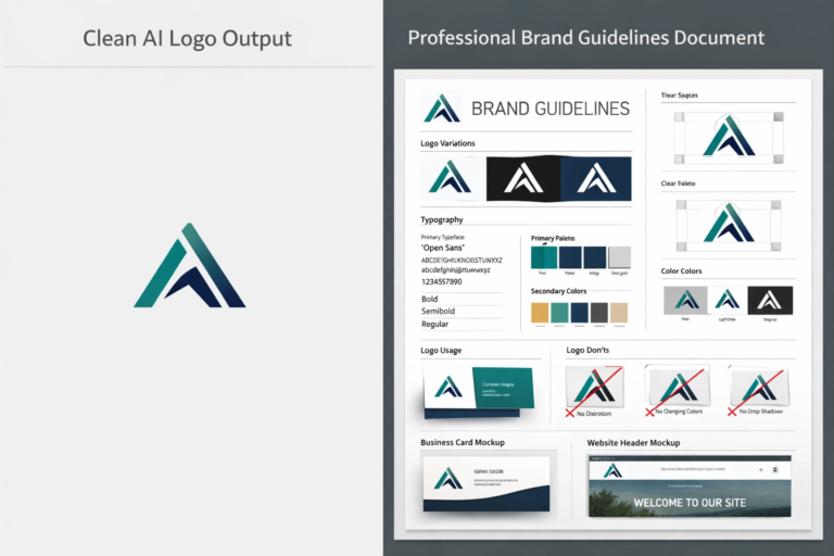
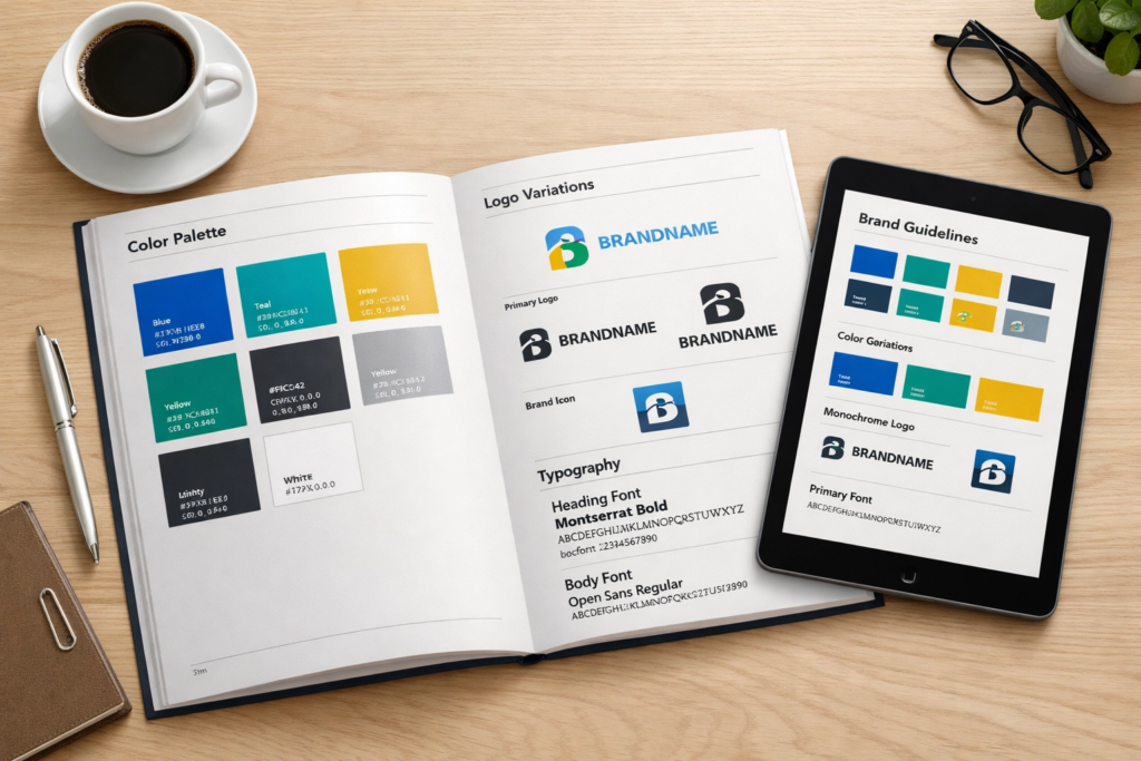
What Is a Brand Style Guide? (Your Key to a Consistent Brand Identity)
A brand style guide — sometimes called brand guidelines — is basically a rulebook for your brand. It documents all the elements above so that anyone working with your brand (designers, social media managers, printers, VA’s) knows exactly how to use it.
A good brand style guide includes:
- Logo usage rules (what to do and what NOT to do)
- Your exact colour values (HEX, RGB, CMYK)
- Font names, sizes, and usage rules
- Image style guidance
- Tone of voice examples
- Don’ts — stretched logos, wrong colours, unauthorised fonts
Even if you’re a one-person business, a brand style guide is worth having. It saves you time, keeps everything consistent, and makes you look far more professional when working with freelancers or agencies. That’s why every one of our branding packages includes a full brand guidelines document as standard.
5 Mistakes That Break a Consistent Brand Identity
We see these all the time. Here’s what to watch out for:
1. Using too many fonts
Pick two, maybe three. Any more and your brand looks cluttered and unprofessional.
2. Ignoring CMYK for print
Your digital colours and print colours are not the same. A beautiful deep navy on screen can print as dull grey if you don’t specify CMYK values. Always brief your printer with the correct colour codes.
3. Having no logo system
One logo file doesn’t cover every situation. Without different versions, your logo will end up squashed, stretched, or illegible on certain backgrounds or at certain sizes. A proper logo design gives you every variant you’ll ever need, done properly from the start.
4. Letting Canva override your brand
Canva is a brilliant tool — but it’s packed with templates that can pull your brand off course. Always customise those templates to your colours, your fonts, and your style.
5. Not having your brand documented
Without brand guidelines, your brand drifts over time. New content starts to look slightly different from old content, and the consistency that builds trust starts to break down.
Does Your Website Reflect Your Consistent Brand Identity?
Even if your brand identity is solid, a poorly designed website can undermine all of it. If your site loads slowly, looks outdated on mobile, or doesn’t clearly communicate what you do — visitors will leave before they even get to see your beautiful branding. If you’re not sure where yours stands, our free Website Audit will show you exactly what’s working and what needs fixing.
Ready to rebuild from the ground up? We offer both a full custom website for businesses that want total control, and a Smart Website package for those who need something professional up and acts as a sales agent.
A Consistent Brand Identity Also Helps You Rank on Google
Having a great brand is brilliant. But if people can’t find you on Google, you’re leaving money on the table. SEO (Search Engine Optimisation) helps your business show up when people in your area search for what you offer — and a strong, consistent brand actually supports your rankings, because Google rewards businesses that look credible and trustworthy across the web.
If growing your visibility is a priority, our SEO service is designed specifically for small businesses that want real, lasting results. And if you’re just getting your head around it all, the Beginner SEO Checklist is a great free place to start — it breaks everything down into simple steps you can action today. Before any of that though, you’ll need a solid domain name, and we always point our clients towards 123 Reg — it’s one of the UK’s most trusted registrars and makes the whole setup process refreshingly straightforward.
Final Thoughts
Building a brand that works across social media, print, and web isn’t complicated — but it does take intention. Start with the five core elements: a versatile logo system, a defined colour palette, consistent typography, a unified imagery style, and a clear brand voice. Document everything in a brand style guide. And adapt your brand to each platform without losing what makes it yours.
If you want help building a consistent brand identity that works across every platform, get in touch with the 36 Visuals team — we’d love to hear about your business and help you build something that turns heads, wherever people find you.