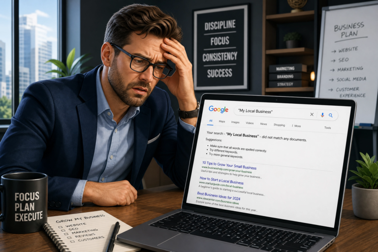
You’ve got traffic coming to your website — but is it actually turning into business? If people are clicking your ads, finding you on Google, or tapping through from Instagram, yet still leaving without doing anything, you’ve got a landing page conversion strategy problem. And honestly? That’s way more common than you’d think.
That’s not a reflection of your product or service. It’s a sign that your page isn’t doing the job it’s supposed to do.
Here’s the thing: according to the Unbounce 2026 Conversion Benchmark Report, the average landing page conversion rate across all industries sits at around 4%. Meanwhile, the top 10% of pages convert at over 11%. That’s a massive gap — and it’s not down to luck. Instead, it comes down to strategy, design, and how well your brand comes across the moment someone lands on your page.
In this guide, we’re going to walk you through exactly what makes a landing page convert, from your headline right through to your call to action. Whether you’re a small business owner or you’re working with a creative team, these are the principles that actually move the needle.
Why Most Landing Pages Don’t Convert (And What the Data Says)
Let’s be real: most landing pages are leaking visitors. Not because the product or service is bad, but because the page is getting in the way.
The Three Most Common Conversion Killers
Here are three of the biggest culprits:
1. A weak or confusing headline Research published in 2026 by Wynter found that 80% of landing page visitors only read the headline and the first line of the subheading before deciding whether to stick around or bounce. As a result, if your headline doesn’t immediately tell someone what’s in it for them, they’re gone. It really is that simple.
2. Too many calls to action Having five different buttons — “Book a call”, “Download our guide”, “View our work”, “Sign up”, “Learn more” — doesn’t give visitors options. Instead, it overwhelms them. In fact, pages with multiple offers convert 266% worse than pages with a single, focused call to action. That stat is wild, but it makes total sense when you think about it.
3. No social proof People don’t want to be the first one to take a chance on you. Therefore, testimonials, reviews, and case study snippets are essential for building the trust that gets someone to actually click. Customer testimonials alone can increase conversions by up to 34%.
Beyond the copy and content though, there’s something even more fundamental: brand. If your page looks inconsistent, generic, or just a bit… off, visitors make a subconscious decision that they can’t trust you. That’s why strong brand identity design isn’t just a “nice to have” — it’s the foundation your conversion strategy is built on.
The Anatomy of a High-Converting Landing Page (And Why Your Conversion Strategy Starts Here)
Now let’s get into the good stuff. A high-converting landing page isn’t magic — it’s a set of proven elements working together, each one playing a specific role in your landing page conversion strategy. Here’s what every page needs.
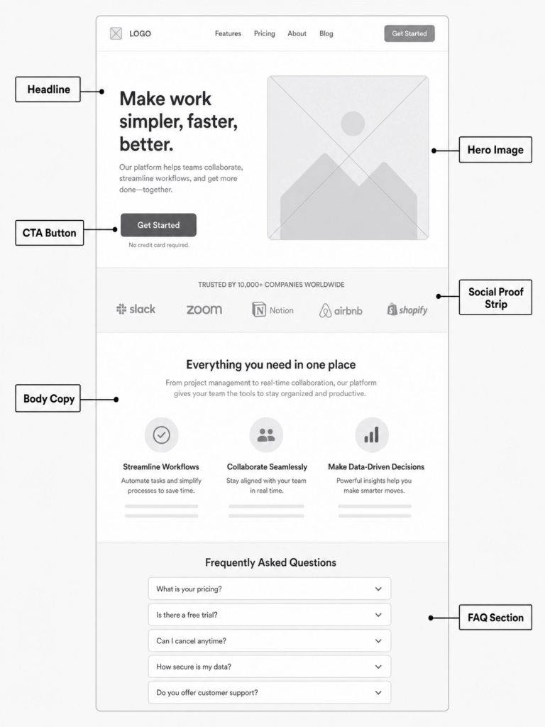
Your Headline: The Five-Second Window
Your headline is the most important thing on the page. Full stop.
Benefit-led headlines — ones that tell the reader what they’ll get — outperform feature-led headlines by 27% on average. Furthermore, if you can put a specific number or result in there, the effect compounds. “Get more enquiries” is vague. However, “Get 3x more enquiries from your website in 90 days” is something people can immediately picture.
Ask yourself: can someone read my headline and immediately understand what I offer and why it matters to them? If the answer’s no, rewrite it.
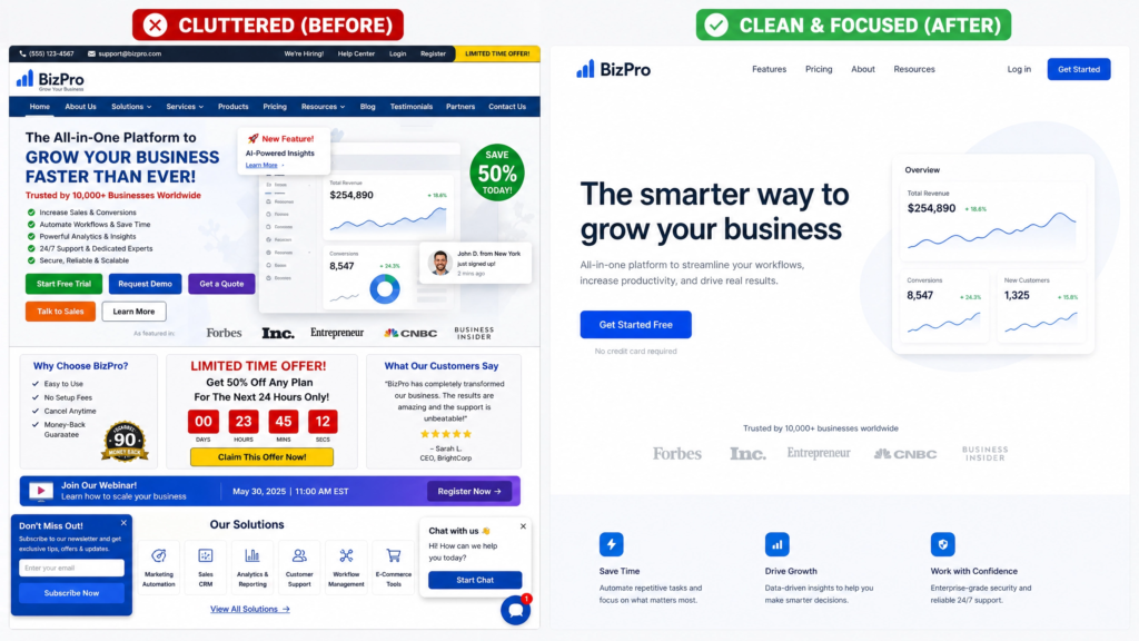
Above-the-Fold Layout: One Message, One CTA
“Above the fold” means everything a visitor can see without scrolling. This section needs to do a lot of work quickly, so keep it focused: one headline, one supporting sentence, one call to action.
57% of visitors never scroll past the first viewport on desktop. On mobile, furthermore, that figure climbs to 64%. So if your most important message and button aren’t right there at the top, a huge chunk of your audience will never even see them.
Good web design services put this hierarchy front and centre from the very first wireframe. It’s not an afterthought.
Visual Hierarchy and Brand Trust
Your page should guide the visitor’s eye in a logical flow — headline → benefit → social proof → CTA. Size, colour, spacing, and contrast all do that job.
This is where brand consistency really earns its keep. When your fonts, colours, and imagery all feel cohesive and professional, visitors trust you faster. When things look mismatched or cobbled together, they hesitate — even if they can’t explain exactly why.
Social Proof: Let Others Do the Talking
Testimonials, star ratings, client logos, project results — these are your trust signals. And placement matters just as much as having them in the first place.
Put social proof near the sections where doubt is most likely to creep in. For example, if someone’s about to fill in a form, they might wonder: “Is this legit? Is it worth my time?” As a result, a well-placed testimonial right above that form can be the difference between a submission and a bounce.
Specific, detailed testimonials work far better than vague ones. For instance, “Really helpful!” tells the next visitor nothing. By contrast, “Our website enquiries went up by 40% in the first month after the redesign” is the kind of proof that moves people.
The Form: Less Is Always More
If you’re capturing leads on your landing page, keep your form as short as possible. Research from Imagescape found that cutting a form from 11 fields down to 4 led to a 120% increase in conversions. That’s not a typo — 120%.
As a rule, only ask for what you genuinely need right now. You can always gather more information later in the process. In most cases, a name and email is plenty to get the conversation started.
Call to Action Design Tips That Actually Drive Action
Your CTA is the point of conversion — and how you design it is central to any effective landing page conversion strategy. Everything else on the page exists to lead the visitor here, so it deserves a lot of attention.
One CTA Per Page — No Exceptions
Pick one primary action for your landing page and stick to it. If you have secondary offers (like a downloadable guide or a video demo), make them visually secondary — smaller, less prominent, lower down. Ultimately, the moment you ask someone to make two decisions at once, you risk them making none.
CTA Copywriting Micro-Tips
The words on your button matter more than most people realise. Here are a few things that consistently make a difference:
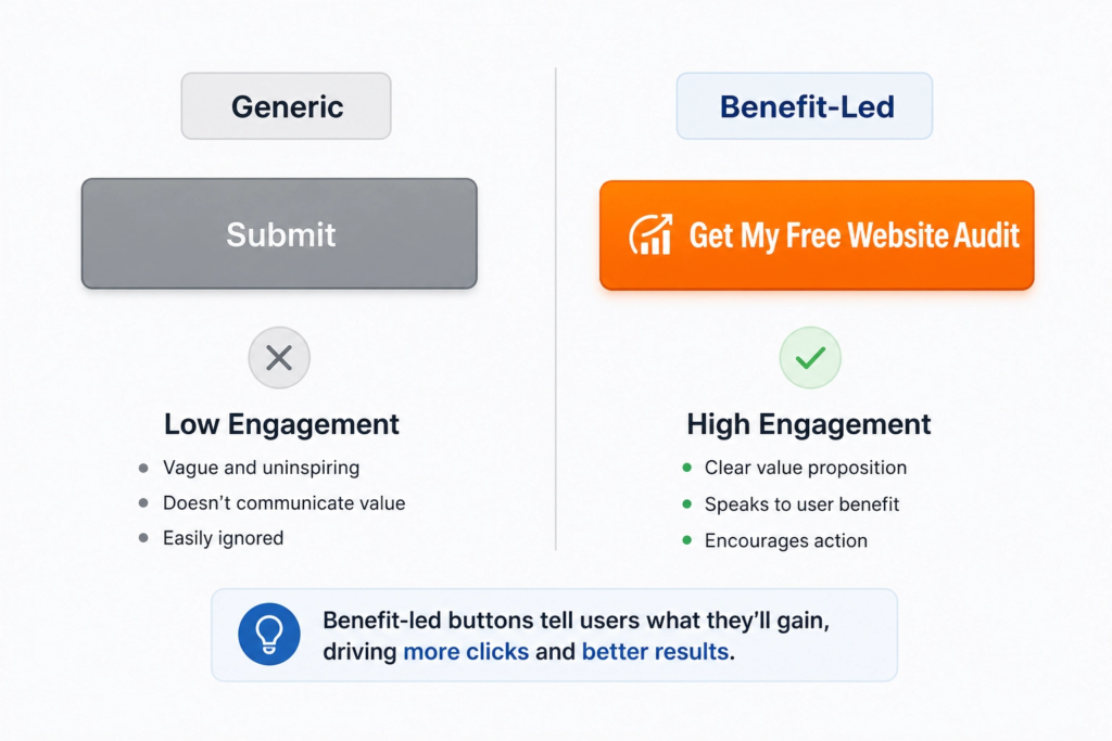
- Start with a verb. “Get started”, “Book your call”, “Download the guide” — action words create momentum.
- Be specific. “Get My Free Brand Review” outperforms “Submit” every single time.
- Focus on what they’re gaining, not what they’re doing. “Start your free trial” focuses on the outcome; “Sign up” focuses on the task.
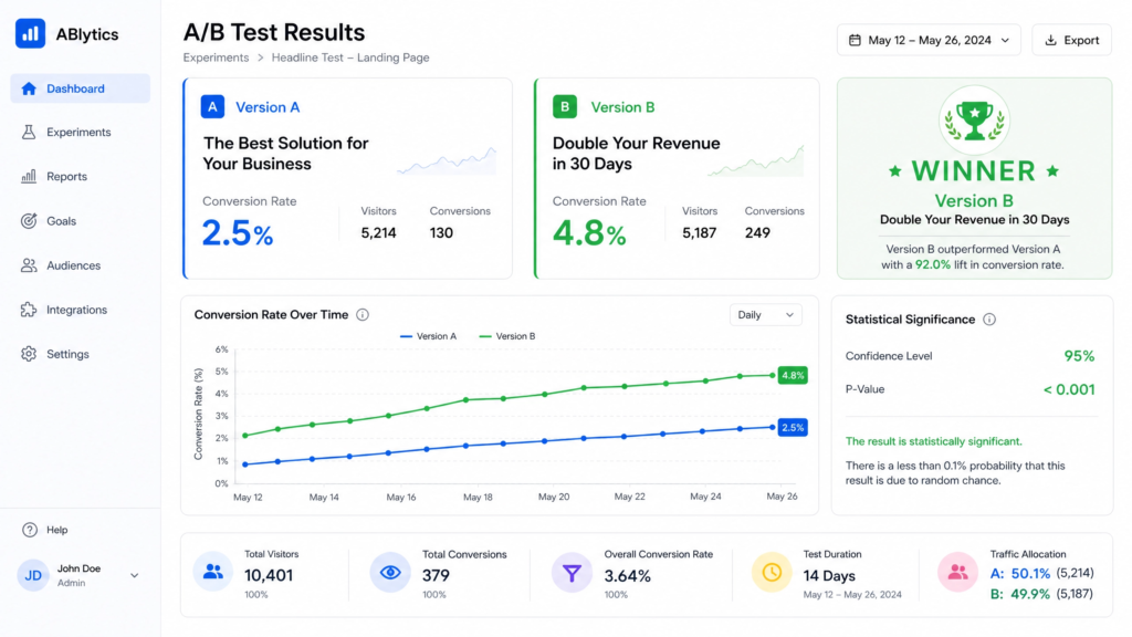
One famous A/B test found that simply changing a CTA from “Sign up for free” to “Trial for free” led to a 104% increase in click-throughs. Same offer, very different framing.
Where to Place Your CTAs
You don’t need to limit yourself to one button — you just need one message. Repeat the same CTA at key points:
- In the hero section — immediately visible, no scrolling required
- Mid-page — after you’ve built up enough context and desire
- Down at the bottom, for visitors who’ve read everything and are finally ready to act
This is particularly important on longer pages where you’re explaining a service, walking through a process, or telling a brand story.
Page Speed, Mobile UX and Core Web Vitals: The Technical Side of Landing Page Conversion Strategy
Here’s a stat that should make every business owner sit up: a one-second delay in page load time reduces conversions by 7%. For a page generating even modest revenue, that adds up fast. In other words, speed isn’t just a technical issue — it’s a direct part of your landing page conversion strategy.
Why Speed Is a Conversion Lever, Not a Tech Afterthought
Speed and conversion are directly linked. Pages that load in one second convert three times more visitors than pages that take five seconds. Moreover, with Google’s Core Web Vitals now confirmed ranking factors, a slow page doesn’t just hurt your conversions — it hurts your visibility in search results too.
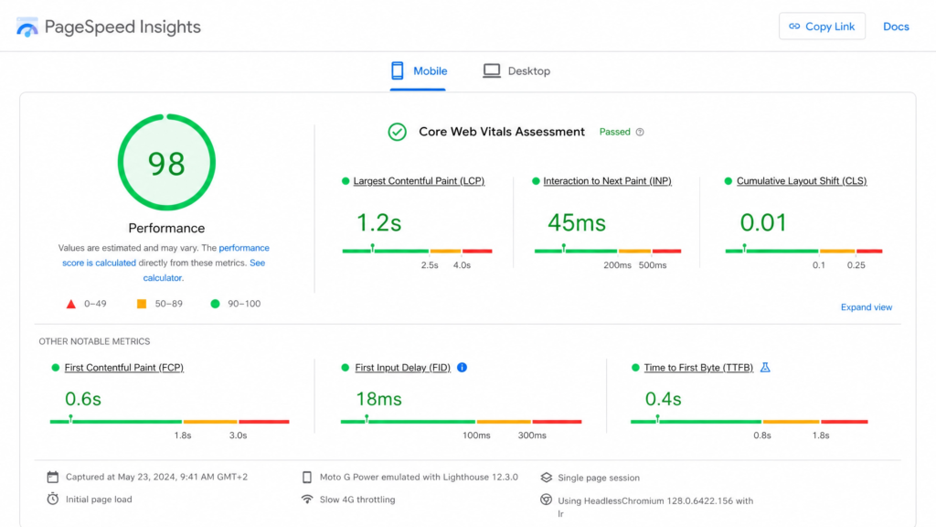
The three Core Web Vitals metrics to focus on in 2026 are:
- LCP (Largest Contentful Paint): Aim for under 2.5 seconds. This measures how quickly the main content of your page loads.
- INP (Interaction to Next Paint): Keep this under 200ms — it measures how quickly your page responds to clicks and taps.
- Cumulative Layout Shift (CLS) should be under 0.1, measuring how stable your page is as it loads — in other words, does content jump around before settling?
If you’re unsure how your site scores, you can test it free at PageSpeed Insights. Or, if you’d like us to take a look, our Website Audit covers all of this in detail.
Mobile-First Design: Designing for Where Your Audience Actually Is
Mobile devices now account for 65% of all landing page traffic. Yet, despite that, the average mobile landing page converts at only 2.8%, compared to 4.8% on desktop. That gap exists because most pages are still designed with desktop in mind first and mobile as an afterthought.
Mobile visitors are often in research mode — they’re curious, they’re comparing, and they’re not necessarily ready to buy right now. So, as a result, your mobile landing page needs to be fast, easy to read, and frictionless enough to capture a lead even from someone who’s just browsing. Large tap targets, short paragraphs, sticky CTAs, and forms with minimal fields all make a significant difference.
Our smart website services are built mobile-first as standard, because that’s where most of your audience is.
How Strong Branding Amplifies Your Landing Page Conversion Strategy
Here’s something that often gets overlooked in conversion rate discussions: branding. Most conversion advice focuses on tactics — button colours, headline formulas, form length. Those things matter. But they work on top of a foundation of trust. And trust, as it turns out, is built through consistent, professional branding. In fact, a strong brand is one of the most underrated elements of any landing page conversion strategy.
Brand Consistency = Subconscious Trust Signals
When a visitor lands on your page from a Google ad or a social media post, there’s a split-second question their brain asks: “Does this feel legit?”
If your landing page looks different from your social media, uses inconsistent fonts, or has imagery that doesn’t match your brand aesthetic, visitors pick up on that — even if they don’t consciously register it. The result is friction, doubt, and ultimately, a lost conversion. In short, inconsistency costs you customers.
Great logo design and a coherent visual identity mean that wherever someone encounters your brand — Instagram, Google, your website — it all feels like the same trusted business.
How Colour, Typography and Imagery Reduce Friction
Every visual element on your landing page either builds trust or erodes it. Colours affect mood and perceived credibility. In addition, typography affects readability and brand personality, while imagery shapes relatability and aspirational connection.
This isn’t about following trends or making things pretty for its own sake. Rather, it’s about removing every possible reason for a visitor to hesitate. The right brand identity design makes your page feel instantly credible — which means visitors spend their mental energy deciding whether to work with you, not deciding whether to trust you.
Positioning Your Brand Promise on the Page
Your landing page isn’t just a place to list your services. It’s where your brand promise meets your visitor’s need.
What transformation do you offer? What problem do you solve? What makes you different from everyone else in your industry? These answers should be woven into your headline, your subheadings, your imagery, and your CTA.
If you’re not clear on what your brand promise is, it might be time to take our Brand Quiz — it’s a quick way to identify where your brand positioning is strong and where it needs work.
Testing and Iteration: How to Improve Your Landing Page Over Time
Even the best landing page isn’t a “set it and forget it” job. In fact, the pages that consistently convert at the highest rates are the ones that get tested, refined, and improved continuously. Think of your landing page conversion strategy as something that evolves — not something you finish.
The Basics of A/B Testing
A/B testing simply means creating two versions of a page (or a single element on a page) and seeing which one performs better. One change at a time is the golden rule. For example, if you change the headline and the button colour and the form length all at once, you won’t know which change actually moved the needle.
Start with the highest-impact elements first:
- Headline copy
- CTA button text
- Hero image or video
- Form length
Companies that test 10 or more variations see 86% better results than those that only run single tests. However, you don’t need to go that deep to start seeing improvements — even one well-run test per month adds up quickly over time.
Key Metrics to Track
You don’t need to obsess over every number, but these are the metrics that matter most for a landing page:
- Conversion rate — the percentage of visitors who complete the desired action
- Bounce rate — the percentage who leave without doing anything
- Scroll depth — how far down the page visitors are actually getting
- Time on page — are they reading, or just glancing?
If your bounce rate is high and scroll depth is low, that’s typically a headline and above-the-fold problem. On the other hand, if your scroll depth is good but conversions are low, the issue is most likely with your CTA or form.
For businesses who want expert eyes on their data, our SEO services include conversion tracking and performance analysis as part of ongoing campaigns.
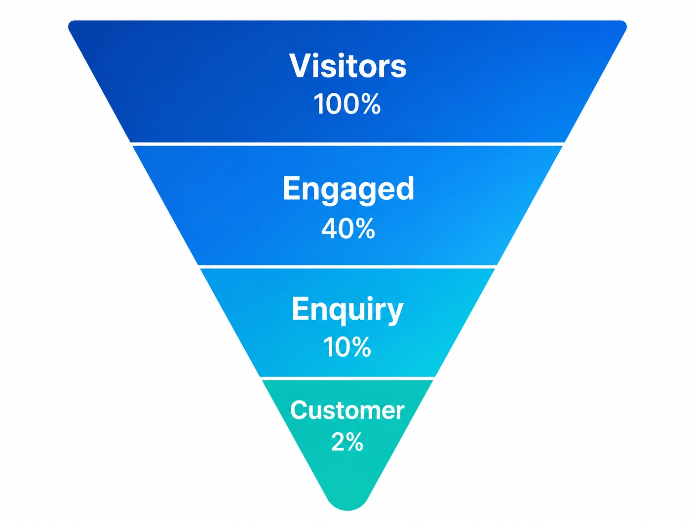
What Does a Good Landing Page Conversion Rate Actually Look Like?
It’s worth having a realistic benchmark in mind before you start testing, otherwise you won’t know whether your results are good, bad, or just average. The industry median sits at around 4% in 2026, but top-performing pages consistently hit 10% or higher. However, what counts as “good” depends heavily on your industry, your offer, and where your traffic is coming from. Warm traffic — people who already know your brand or have been nurtured through email — will always convert at a higher rate than cold traffic from a broad paid campaign. So rather than chasing a single magic number, benchmark against your own past performance and aim to beat it incrementally each month.
How Long Should a Landing Page Be?
This is one of those questions where the honest answer is: it depends. Simple lead gen pages — where you’re offering a free download, a discovery call, or a quick audit — can be short and punchy. Hero section, a few key benefits, social proof, form. Done. More complex services or higher-ticket offers, on the other hand, benefit from longer pages that walk the visitor through the problem, the solution, the process, and the proof before asking them to act. As a rule of thumb, your page should be as long as it needs to be to answer every objection a first-time visitor might have — and not a word longer. If you need more landing pages as your campaigns grow, you can get a domain and hosting sorted quickly through a provider like 123 Reg.
Should Every Campaign Have Its Own Landing Page for Best Conversion?
Ideally, yes. Pages that are tightly matched to the specific message of the ad or email that drove the click consistently outperform generic pages that try to serve everyone at once. This is also a smart move for SEO — more targeted pages means more opportunities to rank for specific search terms, as well as more chances to show up in AI-generated search results for niche queries. Even a small increase in message-match between your ad and your landing page can produce a meaningful lift in conversions. It’s worth the extra effort, and it’s something we factor into every full custom website and campaign build we do at 36 Visuals.
Wrapping Up: Your Landing Page Conversion Strategy Starts with the Basics
A great landing page conversion strategy isn’t complicated — but it does require intention. Here’s the five-part checklist to take away from this:
- Headline first. Benefit-led, specific, and written for your ideal visitor.
- One CTA. Pick one action and build the whole page around it.
- Social proof. Put it near the points of doubt — especially near your form.
- Speed and mobile. If your page is slow or hard to use on a phone, you’re leaving conversions on the table.
- Brand consistency. Every visual element should build trust, not raise questions.