Let’s be honest — most people think a logo is just a logo. You get one made, slap it on your website, and call it a day. But secondary logo use is one of the most important — and most overlooked — parts of building a brand that works. Job done. Brand sorted. Move on.
Here’s the thing: if you’re skipping it, your brand is probably letting you down in more places than you realise.
The problem with one logo
Think about it. Your logo looks great on your website header — nice and wide, plenty of breathing room, everything legible. But then you try to squeeze it onto a business card and suddenly it’s tiny, squished, and impossible to read. Or you upload it to your Instagram profile and it gets cropped weirdly. The text disappears. You’re left with an awkward amount of white space. Or someone asks for a version to put on a branded hoodie and you realise the fine detail just doesn’t translate to embroidery.
Sound familiar? You’re not alone. It’s one of the most common branding problems small businesses run into — and it’s almost always caused by the same thing: having one logo and trying to make it work everywhere.
That’s exactly why secondary logo use matters. A well-designed brand doesn’t just have one logo — it has a whole system of logo variations that work together, each one designed for a specific job, so your brand always looks its best no matter where it shows up.
In this article, we’re going to break it all down in plain English. By the end, you’ll know exactly what a secondary logo is, how it’s different from your primary logo, when and where to use it, and how to tell if your current brand is missing one. Let’s get into it.
What Is a Secondary Logo?
A secondary logo is a simplified or rearranged version of your main logo — what designers usually call your primary logo. It keeps all the important bits intact: your brand colours, your typography, your overall feel. But it presents them in a format that works better in smaller or more constrained spaces.
Think of it like a wardrobe
Your primary logo is your full outfit — the whole look, put together. Your secondary logo is the same brand, just dressed for a different occasion. Same person, same style, just adapted to fit the moment.
In practice, this might mean your secondary logo drops the tagline that sits beneath your main logo. Or it rearranges a horizontal layout into a vertical (stacked) one. Or it removes a secondary graphic element that looks great at large sizes but turns into a muddy blob when shrunk to 40 pixels wide. The goal is always to preserve what’s recognisable while making the logo more versatile.
What a secondary logo is not is a completely different logo. It’s not a rebrand. It’s not a new identity. It should look like it came from the same place as your primary logo — because it did. Someone seeing your secondary logo on a business card and then landing on your website should feel instant recognition, not confusion.
It exists because one logo simply cannot do every job well. A design that looks stunning on a billboard becomes an unreadable mess on a 32×32 pixel favicon. A wide, horizontal logo that works beautifully in a website header just doesn’t sit neatly on a tote bag or stitch cleanly onto a polo shirt. These aren’t flaws in your logo — they’re just the reality of designing for a world where your brand needs to show up in dozens of different contexts, shapes, and sizes.
Secondary logo use solves that problem. It gives your brand the flexibility it needs to show up consistently and professionally, everywhere.
Primary vs Secondary Logo: What’s the Difference?
This is the question we get asked all the time, so let’s clear it up properly — because the distinction matters a lot when it comes to using your brand correctly.
Your primary logo
Your primary logo is the main event. It’s your most detailed, most complete version. It’s the logo you’d put on your website homepage, on a printed brochure, on signage outside your office, or anywhere that gives it room to breathe. It typically includes:
- Your full business name
- Any taglines or supporting copy
- Your icon, illustration, or brand mark (if you have one)
- Your full colour palette doing its thing
- Any other design details — borders, dividers, decorative elements
Because it’s the most complex version, it needs the most space. When you have that space, it’s brilliant. When you don’t, it quickly becomes a problem.
Your secondary logo
Your secondary logo is the stripped-back, adaptable version. Same fonts, same colours, same personality — but with the less essential elements removed and the layout adjusted for tighter spaces. It might be a stacked version of a horizontal logo, or a horizontal version of a stacked one. The specific changes depend on your brand, but the principle is always the same: keep the soul of the logo, lose the complexity.
Fonts, colours, and overall feel must all match the primary. If someone has to look twice to connect your secondary logo back to your primary, something’s gone wrong.
Secondary logo vs submark: not the same thing
One thing worth knowing: a secondary logo is not the same as a submark, although people often mix them up. Your submark (sometimes called a brand mark or icon) is even more stripped back — usually just a symbol, a monogram, or your initials on their own. Think of it as the third tier in your logo system, sitting below your secondary logo. More on that in a moment.
When to Use Your Secondary Logo
Let’s get practical. Secondary logo use isn’t abstract — it’s something you’ll encounter constantly as you create branded materials. Here are the most common situations where your secondary logo is clearly the right choice:
Print and documents
Business cards and invoices
Your primary logo often has too much going on to work well at the small scale of a business card. Text becomes too tiny to read, fine details blur, and the whole thing looks cramped. A secondary logo — usually a stacked or simplified version — fits cleanly and still looks sharp. The same logic applies to invoices, proposals, and business documents where your brand needs to appear without overpowering the content.
Document headers and presentations
Internal documents, pitch decks, slide presentations — these all have headers and footers where your logo needs to sit neatly alongside other content. A secondary logo works far better here than a primary that competes with everything else on the page.
Digital touchpoints
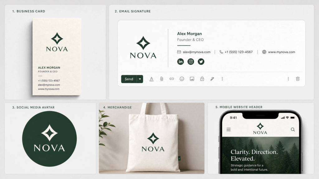
Email signatures
Email signatures are notoriously cramped, and they render differently depending on the email client. A wide horizontal primary logo with a tagline, icon, and brand name is just too much. A clean secondary logo or simple wordmark loads reliably and looks professional across Gmail, Outlook, Apple Mail — wherever it ends up.
Social media profile images
On most platforms, your profile picture is displayed at around 170×170 pixels on desktop — considerably smaller in comments and on mobile. There’s genuinely no room for a detailed logo at that size. Text becomes illegible, detail disappears, and the whole thing turns into a visual blur. A secondary logo or submark is designed for exactly this scenario.
Mobile website headers
On desktop, your website header has plenty of room. On mobile, you might have 60–80 pixels of height in a sticky nav bar. Squishing your primary logo into that space looks messy and often makes the text completely unreadable. A well-built website swaps to a secondary logo or icon on mobile — a small detail that makes a big difference to how polished your site feels.
Physical and branded products
Merchandise
Want your logo on a hoodie, a mug, a tote bag, or a notebook? Physical merchandise introduces constraints that digital design doesn’t face. Embroidery has strict limitations on fine detail and small text. Screen printing on dark fabrics needs solid shapes and strong contrast. A secondary logo — or a clean submark — almost always works better than the primary for physical products. Suppliers like Vistaprint let you preview how your logo looks across formats before you commit to a full print run, which is well worth doing.
Watermarks and photography
When watermarking images — for your portfolio, social content, or stock imagery — a secondary logo or submark is far less intrusive than the full primary version, but still clearly identifiable. You want your brand visible, not dominating the image.
The Full Logo System: What Every Brand Actually Needs
Secondary logo use sits within a bigger picture. A properly built brand identity includes a full logo system — a coordinated set of variations designed to work across every context, at every size, on every surface. Here’s what that complete system looks like:
The four variations every brand needs
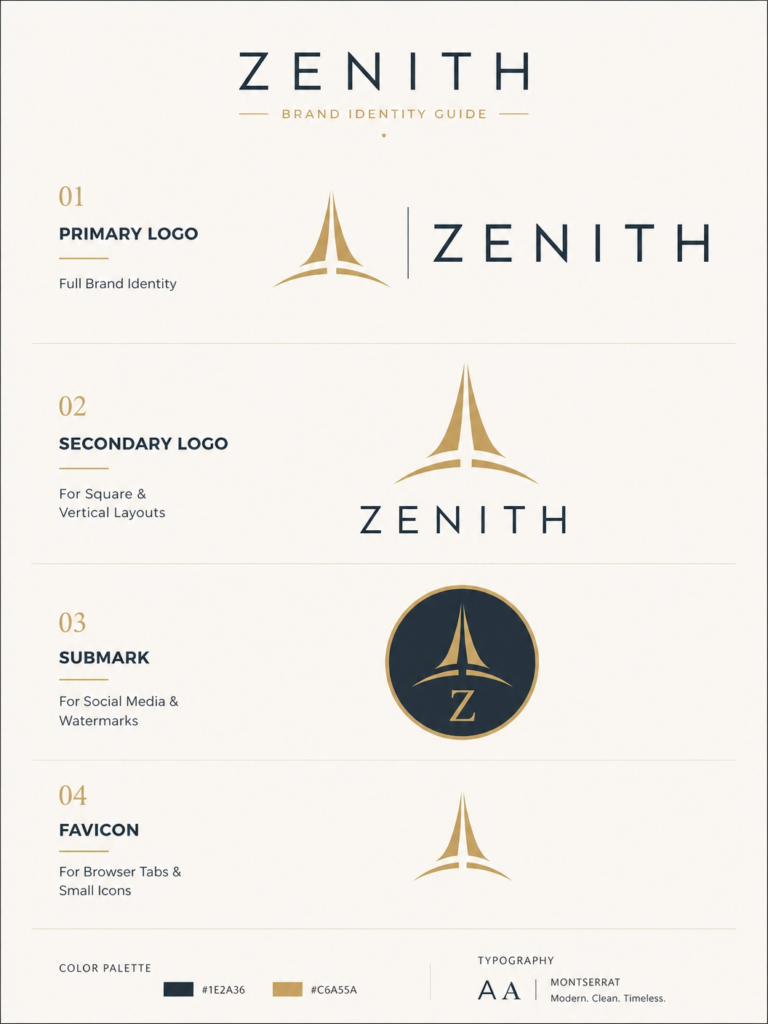
1. Primary logo
Your main brand identifier. The full version with all details intact. Used when space is unlimited and you want your brand to make its strongest impression — website homepage, large printed signage, marketing banners, exhibition stands.
2. Secondary logo
The flexible alternative. Same design DNA, simplified or rearranged for tighter contexts. The workhorse of your brand system — probably the version you’ll reach for most often day-to-day. Business cards, email signatures, social headers, document templates, merchandise.
3. Submark / brand mark
The most simplified version — often just an icon, monogram, or initials as a standalone mark. Perfect for social media avatars, watermarks, packaging patterns, and app icons. Think of it as your brand distilled to its very essence.
4. Favicon
The tiny icon in your browser tab. It needs to be recognisable at just 16×16 pixels, so it must be incredibly simple — usually just a symbol or one or two letters. Many brands adapt their submark slightly for this. It’s small, but it appears on every page of your website.
Real-world examples
Brands like Spotify and Airbnb are textbook examples of a logo system done brilliantly. Spotify uses its full logo — wordmark paired with the green circle icon — on websites and large marketing materials. For app icons and browser tabs, it drops to just the green circle with three curved lines. Airbnb follows the same logic, using its full “Bélo” symbol and wordmark for marketing, and the symbol alone for app icons and social profiles. Both are instantly recognisable whatever version you see. Research into logo systems suggests that brands presenting themselves consistently across all platforms can see revenue lift by around 23% on average — and a systematic approach to logo variations is central to how that consistency gets built.
Not sure whether your current brand has this level of depth? Our Brand Quiz is a quick way to find out.
How to Design a Secondary Logo That Actually Works
If you’re working with a designer on your brand identity — which is almost always the better path — here’s what a solid secondary logo design process looks like. And if you’re reviewing a designer’s work, this gives you a clear framework for evaluating what they’re delivering.
The four-step process
Step 1: Identify the most recognisable elements of your primary logo
Before you can simplify, you need to know what to keep. What makes your logo yours? Is it a specific icon or illustration? A distinctive custom font? A strong colour combination? These are the non-negotiables — the elements that must survive in the secondary version for the brand to remain recognisable. Everything else is up for grabs.
Step 2: Remove what isn’t essential
Taglines are almost always the first thing to cut. They’re important in contexts where your brand needs to communicate its positioning, but rarely essential for simple recognition. Establishment dates, location references, web addresses, and decorative secondary elements can usually go too. The question to ask at every step is: if I remove this, does the logo still feel like the same brand? If yes, cut it. If no, keep it.
Step 3: Reformat the layout
This is where the design work happens. If your primary logo runs horizontally, experiment with a stacked vertical version for the secondary — it’ll fit more naturally into square and portrait spaces. If your primary is already stacked, a compact horizontal lockup might work better as the secondary. The aim is a version that sits comfortably in the spaces where your primary logo doesn’t, without anything being crammed or shrunk to the point of illegibility.
Step 4: Test it properly, in real contexts
This is the step most people skip — and it’s arguably the most important. Don’t just look at your secondary logo on a white artboard in a design file. Put it somewhere real: a business card mockup, an actual email signature, a social media profile image, a mobile website header. Then look at it fresh — does it still look clean, readable, and unmistakably your brand? If yes, you’re done. If anything looks off, go back and simplify further.
Common mistakes to avoid
- Changing the font in the secondary logo, even subtly — this breaks the connection between the two versions and makes them feel like separate brands
- Using different colours or a simplified palette that doesn’t match the primary exactly
- Over-simplifying to the point where the logo loses its identity — there’s a difference between clean and unrecognisable
- Treating the secondary logo as an afterthought rather than designing it as a deliberate, intentional part of the brand system from the very beginning
- Designing only for digital and forgetting to test how it works in print
If you want to see how large brands approach this level of systematic thinking, Google’s Material Design guidelines are publicly available and give a useful sense of the rigour that goes into building a brand that works consistently at every scale and in every context.
Signs Your Brand Needs a Secondary Logo Right Now
Still not sure if this applies to you? Run through this list and see how many ring true.
Five signs to look out for
You’re constantly improvising to make your logo fit.
If you find yourself resizing, cropping, or stretching your logo every time you need it somewhere new — you’re patching a gap that a proper logo system would fill. A full set of variations means you always have the right version ready to go, no improvisation needed.
Your logo is blurry or unreadable at small sizes.
If you can’t read your own logo as a social media profile picture, your audience definitely can’t. This isn’t just an aesthetics problem. It quietly chips away at trust every time someone sees it — and people notice these things even when they don’t consciously realise it.
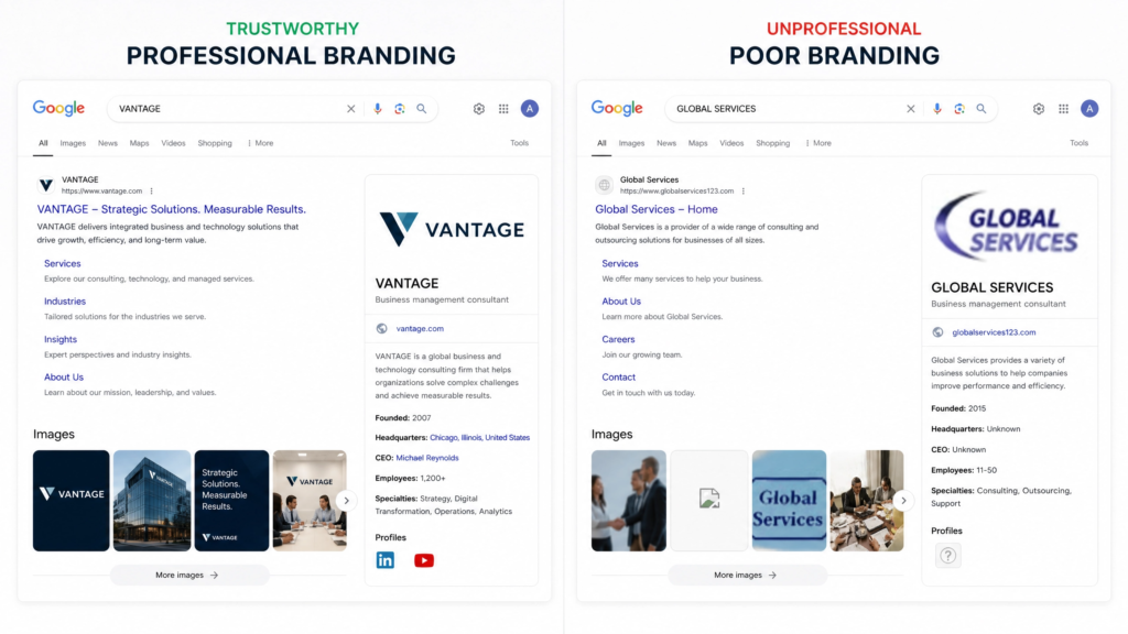
Your branding looks slightly different everywhere it appears.
If your website, Instagram, business cards, email signature, and printed materials all look a bit mismatched — different logo versions, inconsistent sizing, varying amounts of white space — customers feel it, even if they can’t pinpoint what’s off. Research consistently shows that brand consistency has a direct and measurable impact on how professional and trustworthy a business appears. Inconsistency is one of the quietest ways a brand erodes its own credibility.
You’ve had to apologise for the way your brand looks.
If you’ve ever said “sorry about the logo, it doesn’t really work on here” — that’s your cue. Your brand should make you confident, not self-conscious. Every time you’re embarrassed by how it looks somewhere, that’s a signal worth paying attention to.
You only have one logo file.
If your entire brand lives in a single PNG or JPEG file, that’s a red flag. A properly built brand identity comes with a full set of files — different logo variations, different colour versions (full colour, mono, reversed for dark backgrounds), and different file formats for print and digital. If your designer delivered a single file and called it done, you weren’t given a complete brand system.
Secondary Logo Use and Your Online Visibility
Here’s something that often gets overlooked: the way your logo system is set up has a knock-on effect on your online visibility and search performance.
Brand consistency as an SEO signal
When your brand looks consistent across your website, social profiles, Google Business Profile, and any other online presence, it builds what’s called brand authority — a signal that tells search engines (and people) that you’re an established, credible business. According to research from Lucidpress, consistent brand presentation across platforms can increase revenue by up to 23%. That consistency starts with having the right logo for the right context, everywhere your brand appears.
What inconsistency actually costs you
A messy or inconsistent brand sends subtle signals to both potential customers and search algorithms. It can suggest a business isn’t fully established. Higher bounce rates, less time on page, and reduced trust can all follow — and those are factors that affect how much Google values your domain over time. A clean, professional brand that looks polished everywhere it appears builds the kind of trust that keeps people engaged and encourages them to take action.
This is why brand identity and web design are so closely linked — each one reinforces the other. If you’re curious about how your website is currently performing from a trust and conversion perspective, our free Website Audit is a good starting point.
Pulling It All Together
Let’s bring it back to basics, because at its core this is a simple idea.
One logo is a starting point — not a system
Your primary logo is your brand at full power — detailed, complete, and designed for moments when space is no object. Your secondary logo is your brand in a more flexible, adaptable format — built for the dozens of everyday contexts where the primary just doesn’t fit. Together, alongside your submark and favicon, they form a logo system that keeps your brand looking deliberate, consistent, and professional. Whether it’s on a three-metre exhibition banner or a tiny browser tab on someone’s phone.
A brand with only one logo is a bit like a builder who only owns one tool. Sure, you can make it work. You can improvise, adjust, and force it into situations it wasn’t built for. But you’re making every job harder than it needs to be, and the results usually show.
What to do next
Building a proper logo system doesn’t have to be complicated — it just has to be intentional. If you’re starting your brand from scratch, it’s worth doing it properly from day one. If your current logo is already causing issues — the squishing, the blurriness, the apologies — it might be time to look at what’s missing.
Have a browse through our portfolio to see how a full brand identity comes together, or get in touch if you’d like to have a conversation about where your brand is at. No pressure, no pitch — just a chat.