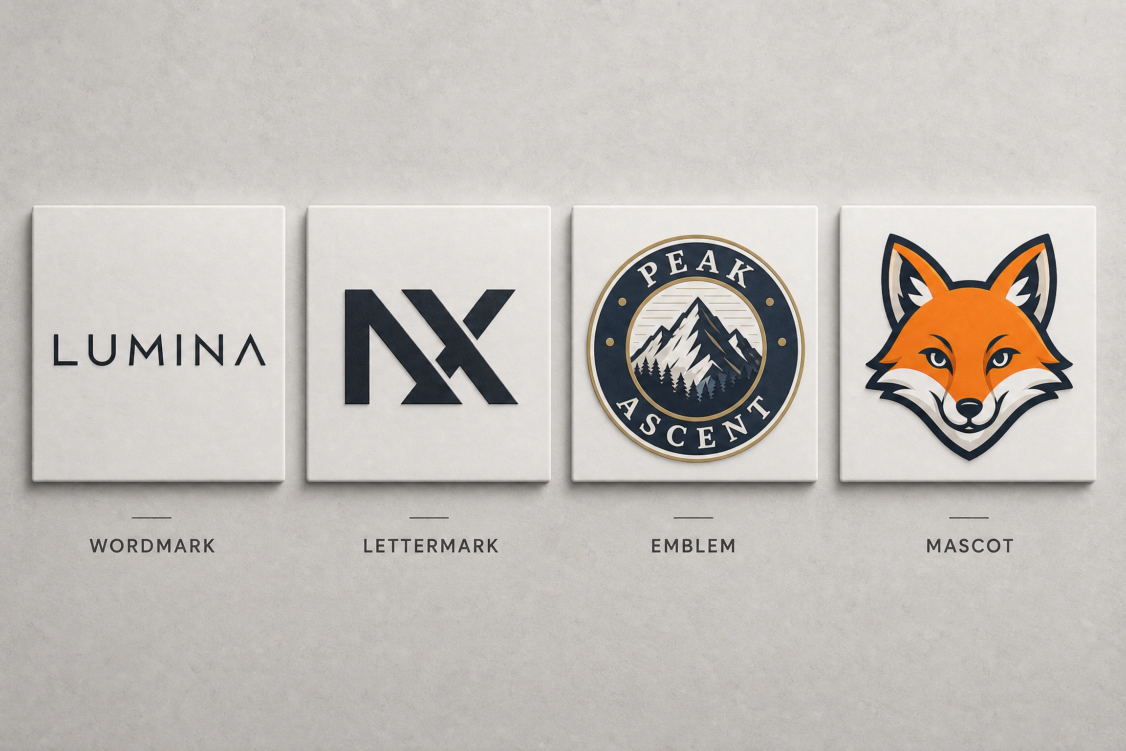

Picking a logo feels like a big decision. It is a big decision. But before you jump into colours and fonts, there’s one thing worth understanding first: not all logos work the same way. This guide has logo types explained in plain English, with real examples, so you can figure out which style fits your business. Whether you’re starting from scratch or planning a rebrand, knowing your options makes the whole process far less stressful.
Prefer to watch? Here’s a quick overview.
Why Understanding Logo Types Matters
A logo isn’t just a nice picture next to your business name. It’s often the first thing a customer notices about you, whether that’s on your website, a shop front, or a delivery van. The type of logo you choose affects how easy it is to recognise. It also affects how well it shrinks down small, and how much room you have to grow later on.
Get it right, and your logo becomes something people remember instantly. Get it wrong, and you might end up with something that looks great on a poster but turns into a blurry mess on a business card. Having logo types explained clearly, before any design work begins, helps avoid that. It forms part of a proper brand identity that works across your whole business, from your website to your packaging.
Think about how many places your logo has to show up. It needs to work on a website header, an app icon, packaging, a van, an invoice, and a social media picture. That’s a lot of jobs for one small design to handle. A logo that only works in one place isn’t doing its job properly. This is why the type of logo matters just as much as the colours or the font.
The 7 Main Logo Types Explained
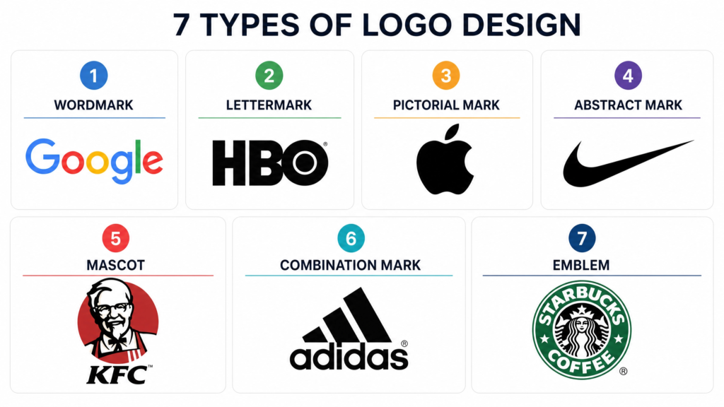
Most logos fall into seven main styles. Some businesses stick to just one style. Others mix a couple together. Here’s each logo type, explained with real examples.
Wordmark (Logotype)
A wordmark uses only the business name, written in a distinctive font. There’s no picture or symbol, just strong typography doing all the work. Google, Coca-Cola, and Visa all use wordmarks. These brands have names that are short, catchy, and easy to say, which is exactly why a wordmark suits them so well.
This style suits new businesses that want people to learn their name quickly. It works best when your business name is fairly short. A long or hard-to-pronounce name can make a wordmark look cluttered, especially on smaller spaces like a favicon.
Lettermark (Monogram)
A lettermark uses just the initials of a business, rather than the full name. IBM, HBO, and NASA are classic examples. Try fitting “National Aeronautics and Space Administration” onto a small badge and you’ll see the problem straight away. A lettermark shrinks a long or clunky name down into something short and recognisable.
A lettermark could work well if your business has a mouthful of a name, or one that’s genuinely hard to spell. This style only really works once people already know a bit about your business, since initials alone don’t tell a new customer much.
Pictorial Mark (Brand Mark)
A pictorial mark is an icon or symbol that represents your brand, with no text at all. The Apple logo is the classic example. Most people recognise that little apple shape without needing the word “Apple” written anywhere near it.
Pictorial marks usually only work once people already know a brand well. A brand-new business with just a symbol and no name won’t mean much to new customers yet. Once you’ve built up recognition, though, a pictorial mark becomes incredibly powerful and flexible.
Abstract Mark
An abstract mark is a shape or symbol that doesn’t represent anything literal. It’s more of a concept or feeling captured visually. The Pepsi globe and the Adidas stripes are both abstract marks. Neither looks like a real object; they’re simply distinctive shapes that people now link to the brand.
Abstract logos stand out well, since they aren’t limited to drawing an actual object. They can take longer to become memorable, purely because there’s no obvious link between the shape and what your business does.
Mascot Logo
A mascot logo is a character-based design. Think of the KFC Colonel or Duolingo’s owl. Mascots bring a lot of personality and warmth to a brand. This makes them a favourite for businesses that want to feel fun, friendly, or family-orientated.
Mascots build a strong emotional connection, especially with younger audiences. They don’t always suit more serious or corporate industries, though. A law firm or financial services company might find a mascot feels out of place.
Combination Mark
A combination mark pairs a symbol with text, so you get both a pictorial or abstract mark and a wordmark or lettermark together. Burger King, Doritos, and Lay’s all use combination marks. It’s one of the most popular logo styles around. You get the best of both worlds: instant name recognition, plus a symbol you can use on its own once people know you.
This flexibility makes combination marks a safe starting point for a lot of small businesses. You get a proper introduction through the name. You also get a symbol you can grow into using on its own later, such as on social media pictures or app icons.
Emblem
An emblem is a logo where the text sits inside a symbol, badge, or shape, a bit like a stamp or seal. Harvard University, Starbucks, and most sports team badges use emblems. They tend to feel traditional, official, and trustworthy, which is why schools, government bodies, and heritage brands often choose them.
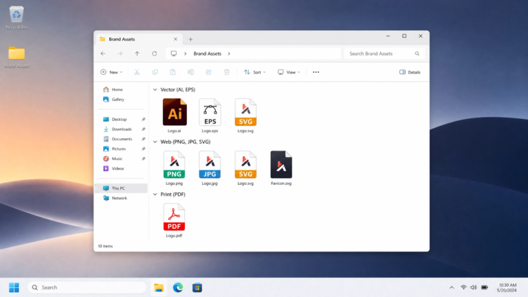
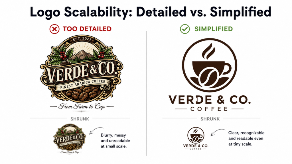
Watch out for detail loss at small sizes with an emblem. A badge that looks brilliant on a shop sign can turn into an unreadable smudge on a mobile app icon. Many businesses that choose an emblem style keep a simplified version on hand for smaller uses, with much less fine detail.
There’s also a growing trend towards dynamic and animated logos. These shift slightly depending on where a business places them, a bit like how Google changes its logo for different holidays. It’s worth knowing this style exists. Most small businesses, though, will find one of the seven core logo types above does the job perfectly well.
Wikipedia has a solid general overview of logo design and how it’s evolved over time. The Design Council, a respected UK design body, also has some genuinely useful thinking on visual identity for anyone who wants to dig deeper.
How to Choose the Right Logo Type
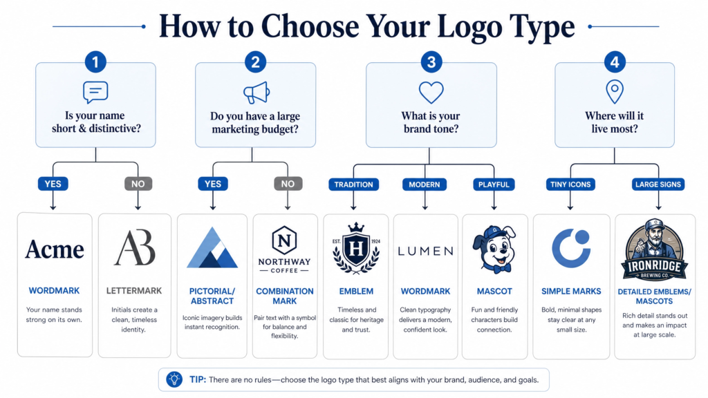
There’s no single “best” logo type, only the type that’s best for your business. With the main logo types explained above, the next step is matching one to your own situation. Ask yourself these questions before you decide.
Logo Type Tip 1: Consider Your Business Name
Short, punchy names suit wordmarks well. Long or complicated names often work better as a lettermark or combination mark instead.
Logo Type Tip 2: Think About Where It Will Appear
A logo that mainly appears on a website, app icon, or social media needs to work at a tiny size. This rules out anything too detailed, like a busy emblem.
Logo Type Tip 3: Leave Room to Grow
Businesses planning to expand into new products or services benefit from a flexible style. A combination mark or abstract mark gives you space to evolve without needing a full rebrand later.
Logo Type Tip 4: Match the Feeling You Want
A mascot suits a playful, approachable brand. An emblem suits something traditional and trustworthy. Abstract or wordmark styles tend to suit a modern, clean feel.
It’s also worth looking at your competitors’ logos, not to copy them, but to make sure your brand doesn’t blend in. If everyone in your industry uses the same style of logo, that’s a good reason to try something different. Your brand can then catch the eye instead of getting lost among similar businesses. Creative Bloq has some good real-world case studies on this, if you’d like to see how established brands have approached it.
Some business owners prefer to talk this through with a designer rather than decide alone. The right logo type depends on several factors working together. That kind of conversation usually forms part of a wider branding process, alongside things like colour palettes, fonts, and logo design itself.
Common Logo Type Mistakes to Avoid
Even with the main logo types explained, it’s still easy to trip up when it comes to picking one.
Choosing Something Too Detailed for Small Spaces
A gorgeous, intricate emblem might look stunning on a shop sign. If it turns into a blurry blob as a small app icon, though, it isn’t doing its job. Always shrink a logo right down and test it before committing to it.
Copying a Competitor’s Style
Just because every business in an industry uses a combination mark doesn’t mean that’s automatically the right choice. Standing out sometimes means doing the opposite of what everyone else does.
Skipping the Black-and-White Test
A strong logo should still work in a single colour. Try it on an invoice, on packaging, or on a t-shirt. A logo that only works in full colour often relies too heavily on colour rather than shape.
Designing the Logo in Isolation
A logo is only one piece of a bigger picture. It needs to sit comfortably alongside a website, social media, and packaging. Thinking about the full brand identity from the start pays off, rather than treating the logo as a standalone task. A well-planned web design project usually factors the logo in from day one, rather than squeezing it in afterwards.
Domain names matter here too. A new business picking a logo style often needs to lock in a matching domain name around the same time. Services like 123 Reg make that part fairly straightforward.
Final Thoughts on Choosing the Right Logo Type
Hopefully, with the main logo types explained and broken down here, your business has a clearer idea of which direction suits it best. There’s no universally “best” logo type, only the one that fits your name, your industry, and the direction your brand is heading. Take time with this decision, because a logo you build on the right foundations will serve your business for years, not just months.
A logo works hardest as part of a bigger system. It needs a website that presents it well. It also benefits from an SEO setup that helps people find the business, and brand materials that carry it consistently, right down to things like a brand promo video. Some businesses run a free website audit around this time too. It’s a quick way to check nothing else holds their site back once the branding is complete.
Logo Types Explained: Frequently Asked Questions
Businesses use combination marks more than any other type. This style pairs a symbol with text and gives businesses the flexibility to use either element on its own once people know the brand better.
Yes, definitely. Plenty of well-known brands do exactly that. Dove and Burger King both blend a pictorial mark with a wordmark, for example. No rule says a logo has to fit strictly into one category.
A combination mark usually works best for a brand-new business. It introduces the name and a symbol together, which helps people learn who the business is faster than a symbol alone.
Not a different type, but a simplified variation often helps. Designers often create a lettermark or icon-only version of the main logo specifically for small formats like app icons and profile pictures. This usually forms part of a wider logo system rather than a separate design.
Costs vary a lot depending on what the package includes. A one-off logo file and a full brand identity, complete with colours, fonts, and guidelines, are very different jobs. It’s worth asking what the price covers before comparing options. A cheap logo without a supporting brand system often costs more to fix later. Some studios, including ours, offer a free Brand Quiz that helps narrow down the right style before you speak to anyone.